SHOOT
Copyright DrupalExp 2014
made with the Documenter v2.0
made with the Documenter v2.0
Thank you for purchasing the theme, If you have questions please submit your ticket to support forum
Shoot is a multi-purpose Drupal theme responds to the most demanding customers for any commerce, business, corporate, portfolio, products, marketing website. It's integrated with Drupal Commerce that let’s you easily build your own commerce solution. The theme with drap & drop layout builder with fully responsive design and retina ready, looks stunning on any device. It features a very clean and professional design that is perfect for showcasing your work, and have tons of shortcode possibilities with unlimited variations and colors.
Feel free to visit our support forum if you need any support for the theme that cannot be found in this documentation.
Full installation
The quickstart package came with theme helps you to build a copy of our live demo at http://demo.themesvision.com/#Shoot. It is the highly recommended way for newbies or if you don’t want to go through the individual setup of each module and theme.
STEPS to do:
Profile installation
We provide 2 profiles are drupalexp_shoot (without integrate Drupal commerce) and drupalexp_shoot_commerce (integrate Drupal commerce) which are used to quickly install new sites with the Shoot theme. These profiles will install all required modules and setup the Shoot theme as the default them
STEPS to do:
Theme Only
The following explains how to install the theme with existing sites. In order to do this there are several steps that must be completed.
Shoot theme provides many settings which help you control your site very easily. By access to Appearance → Settings → Shoot you can see settings as below:
NOTE: You SHOULD reference to Drupalexp Framework when reading this section to understand clearly.
Shoot sub theme extends from Drupalexp framework provides the ability to build any responsive layout you can think of by using simple actions such as Drag & Drop elements on UI. It also supports to create multiple layouts, so you can show your pages with different shapes very easily.
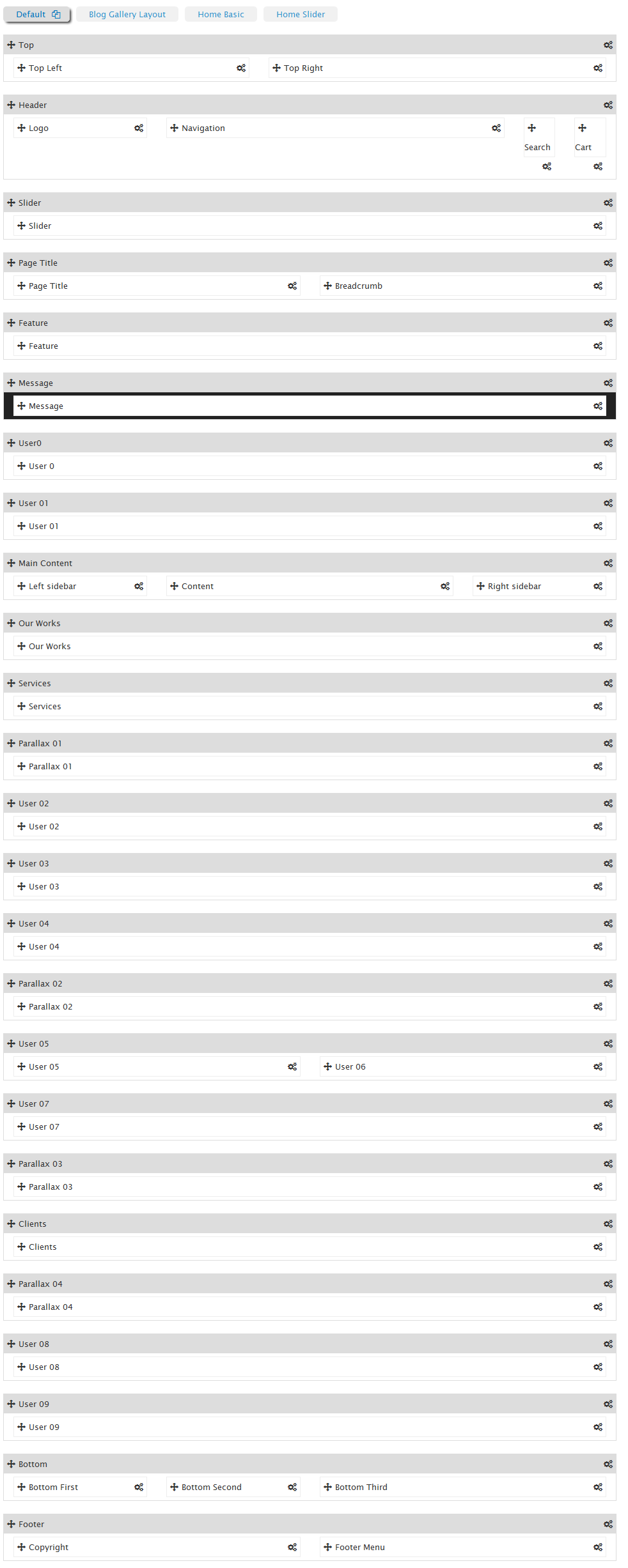
Figure : Sample layout in Shoot theme
Top, Header, Page Title... with gray background called sections. Elements in each of section and unassigned area called regions.
Using this framework you can move to change the order of sections and regions, set the widths of individual block regions or remove from the site layout.
In Shoot theme, you can build unlimited layouts. To create a new layout, click on Add layout link, the system will create a copy of Default layout that.
You can customize on this layout to get layout which you like by
To clone a layout, click on the name of layout which you want to duplicate. After that, click on clone icon to create a duplicate of layout was chosen.
To remove a layout, click on the name of the layout which you want to clone (except default layout). After that, click on delete icon to remove this layout from Shoot theme.
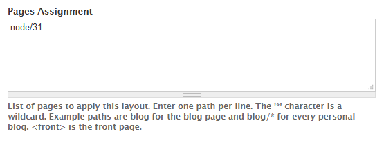
When you create a new layout, you can set pages will be display with this layout by inputting path to Pages Assignment textarea at bottom layout.
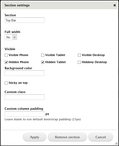
You can re-order sections or move regions in section to other sections. Ex: If you want banner section to appear above header section, you can drag the banner section above the header and save the settings. Saving these settings will automatically apply these changes when you view the front end of your site. Additional, you can customised through:
Similar to sections, you can use the same arrows per region to change the order at which they are rendered within each of section or move them to another sections.
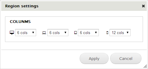
By clicking the gears icon on each region you can set width to each region on different devices.
Based on Twitter Bootstraps 3.x with 12 columns system, you can specify the width of each region. All regions within each section of the theme should add up to 12 cols.
Shoot theme provides dark and white styles.
Preset begin with "Dark-" prefix will be dark style
Preset begin with "White-" will get white style.
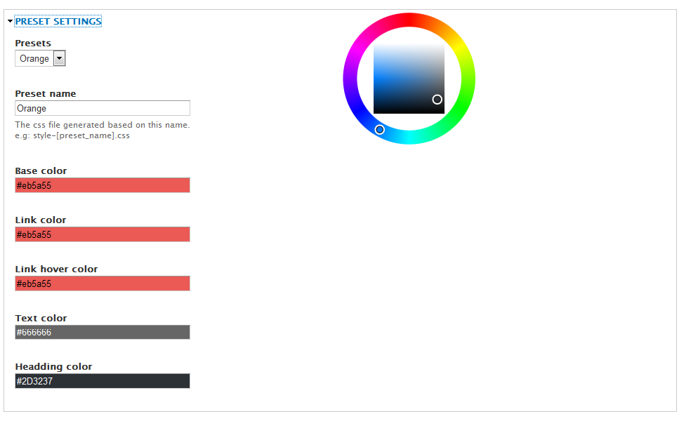
To set default color for the theme by clicking on Presets vertical tab at the left side and choose color in dropdown labeled Default preset
The Preset settings provide the functionality to create your own colors so that you can have full control over the color scheme of your website.
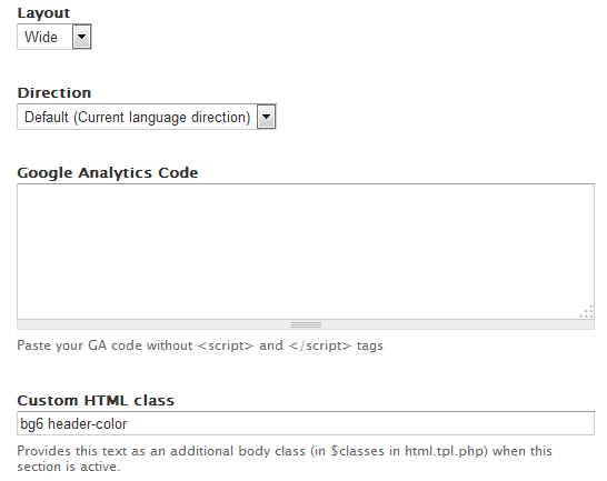
The direction allows the theme to display with different reading style.
- Default (current language direction). Ex: English has default direction LTF while Arabic has RTL defaultIt is ONLY use in layout boxed and no effect in Wide. You should create class(es) for your background site and put it into text Custom HTML Classes field. You can define more your owner classes to custom background image site which you think.
Shoot theme support 8 background images with class from bg1->bg8. You can see how background show in Quick setting demo site
Shoot supports 3 different style header are: White color, Background color and Dark color
If you want to set header with:
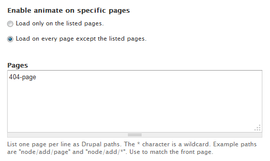
Enable
Disable
animation effect on specific pages by inputting Drupal paths to Pages textarea.
Note: We can use wildcard character such as * in path
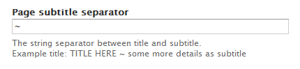
By accessing to DrupalExp → Page Settings menu, you can configure sub title page by putting a split character to split between title and sub-title. We use "~" character such as default. You can modify to any character which you like.
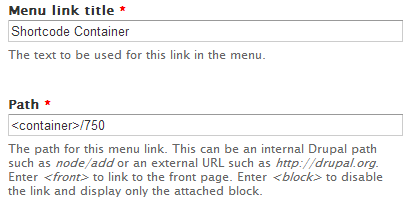
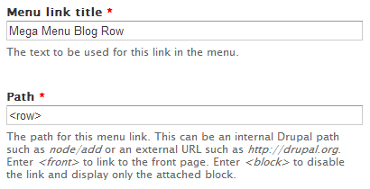
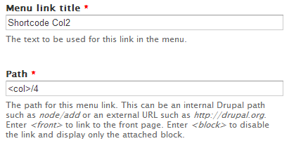
Mega menu in drupalexp is using bootstrap 3.x. In Shoot theme, the menu at header region is located at http://yoursite.com/admin/structure/menu/manage/main-menu.
To make a menu item become mega (can be divide into columns, can be load block...), from this menu item you follow steps as below:
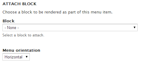
To assign a block into menu item, choose a block from block list in Attach Block field set at bottom page when creating or editing menu item. See screen shot:
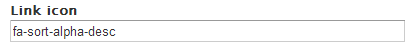
To display a icon Font-Awesome before menu item, put a class into Link-Icon text-field when creating or editing menu item. Ex: fa-home...
Please follow this video to make a slider https://www.youtube.com/watch?v=2-km9lH9-Ss
When you write content for your website, chances are, you’ll use a lot of the same HTML and CSS to include special functionality on specific pages. The problem is, repeating this code, day in and day out, can be tedious and prone to errors. Shortcodes are just that, short bits of code that cut down on repetitive strings of HTML, and can be inserted anywhere in your site.
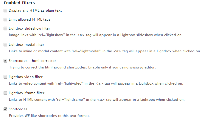
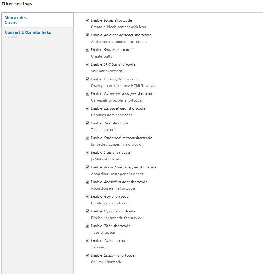
The available shortcodes can be activated by going to Configuration → Text Formats → Full HTML → Configure. Once here you need to enable the Shortcodes filter. This will enable the module filter to be able to setup available shortcodes.
The following shortcodes are included with Shoot theme. You can see shortcode demo at Shortcode Shoot demo by accesing to Shortcodes menu item
Accordion shortcode allows you to provide multiple panes and display them one at a time. We can create an accordion quickly by using syntax as below:
[accordions class="CLASS_WRAPPER"]
[accordion title="TITLE_ITEM_1" expand="TRUE|FALSE" class="CLASS_ITEM"]Content Item 1 here[/accordion]
[accordion title="TITLE_ITEM_2" expand="TRUE|FALSE" class="CLASS_ITEM"]Content Item 2 here[/accordion]
[accordion title="TITLE_ITEM_{I}" expand="TRUE|FALSE" class="CLASS_ITEM"]Content Item {I} here[/accordion]
[/accordions]
In Shoot theme, we pre-defined CLASS_WRAPPER can be:
NOTE: - Default value of expand property is FALSE
- You can define more than class if you want
You can reference to link to view how shortcode display
Tabs shortcode is used for structuring content with tabs (uses DIVs). Each tab has title and content. When certain tab is selected, its content is displayed. Each tab can have two states - selected and unselected. You can insert horizontal or vertical tabs.
We can create a tab quickly by using syntax as below:
[tabs class="STYLE"]
[tab title="TITLE_ITEM_1" icon="ICON_NAME_ITEM_1"]Content Item 1 here[/tab]
[tab title="TITLE_ITEM_2" icon="ICON_NAME_ITEM_2"]Content Item 2 here[/tab]
[tab title="TITLE_ITEM_3" icon="ICON_NAME_ITEM_3"]Content Item 3 here[/tab]
[/tabs]
NOTE: STYLE can be one of values
You can reference to link to view how shortcode display
We can create a featured box quickly by using syntax as below:
[box align="left|right|center" border ="none,square,circle" background="yes|no" icon="ICON" title="TITLE"]CONTENT HERE[/box]
You can reference to link to view how shortcode display
We can create a service box quickly by using syntax as below:
[flipbox type='icon|img' icon='ICON' image='IMAGE' title='TITLE']CONTENT[/flipbox]
Pie chart bar displays status of a determinate or indeterminate process. We can create a pie chart quickly by using shortcode with syntax as below:
[piegraph percent="PERCENT" title="TITLE"][/piegraph]Example:
[piegraph title='Graphic Design' percent='70' width='']Lorem ipsum dolor sit amet, consectetuer adipiscing[/piegraph]
You can reference to link to view how shortcode display
[skillbar percent='']Title[/skillbar]
[skillbar percent='70']Adobe Photoshop[/skillbar]
[skillbar percent='90']Adobe Illustrator[/skillbar]
[skillbar percent='100']Adobe Dreamviewer[/skillbar]
[skillbar percent='90']Drupal[/skillbar]
[skillbar percent='95']HTML & CSS[/skillbar]
[skillbar percent='100']Customer Support[/skillbar]
You can reference to link to view how shortcodedisplay
The carousels are a dynamic presentation of contents where text and images are made visible or accessible to the user by cycling through several items. We can create a carousels bar quickly by using shortcode with syntax as below:
[carousels items="TOTAL_ITEM"]
[carousel path="PATH_TO_IMAGE" sequence="0"]CAPTION_HERE[/carousel]
[carousel path="PATH_TO_IMAGE" sequence="1"]CAPTION_HERE[/carousel]
[carousel path="PATH_TO_IMAGE" sequence="2"]CAPTION_HERE[/carousel]
[/carousels]
NOTE: path can be format: public://
[carousels items="3"]
[carousel path="http://statics.drupalexp.com/Shoot/02_about.png" sequence="0"][/carousel]
[carousel path="http://statics.drupalexp.com/Shoot/03_about.png" sequence="1"][/carousel]
[carousel path="http://statics.drupalexp.com/Shoot/04_about.png" sequence="2"][/carousel]
[/carousels]
You can easily add any of built in icons from Font Awesome to your sites with our new icon shortcodes by using syntax:
[icon name="NAME" link="URL"]TEXT_HERE[/icon]
NAME is a valid class name in font owesome
Access to http://fortawesome.github.io/Font-Awesome/icons/ to get valid classes
Example: fa-adjust, fa-anchor...
You can reference to link to view how shortcodedisplay
You can create beautiful buttons on the fly using the button shortcode. Choose between various colors, styles and sizes. We can create s button by using shortcode with syntax as below:
[button size="SIZE" bg="BACKGROUND_COLOR" type="TYPE" color="TEXT_COLOR" url="LINK_TO"class="CLASS"][/button]
TYPE property can be one of values:
We have many button styles in Shoot theme are: Button outline, Button inline, flat button... by using classes such as: dexp-btn-reflect,dexp-btn-hover-flap, dexp-icon-right
You can reference to link to view how shortcodedisplay
You can create a statistics item to run by javascript by syntax:
[stats timer="TIMER NUMBER" number="NUMBER VALUE" class="brddark"]TITLE[/stats]
With the column layout shortcodes you can now break down your content into any number of advanced layouts giving variety and hierarchy. We can create column layout quickly by using shortcode with syntax as below:
[column cols="NUM_OF_COLS" begin="0-OR-1" end="0-OR-1"]CONTENT HERE [/column]
Example:
- Shortcode of 2 columns (width = 1/2):
[column cols="6" begin="1"]CONTENT HERE [/column]
[column cols="6" end="1"]CONTENT HERE [/column]
- Shortcode of 3 columns (width = 1/3):
[column cols="4" begin="1"]CONTENT HERE [/column]
[column cols="4"]CONTENT HERE [/column]
[column cols="4" end="1"]CONTENT HERE [/column]
- Shortcode of 4 columns (width = 1/4):
[column cols="3" begin="1"]CONTENT HERE [/column]
[column cols="3"]CONTENT HERE [/column]
[column cols="3"]CONTENT HERE [/column]
[column cols="3" end="1"]CONTENT HERE [/column]
- Shortcode of 2 columns (width = 1/4 and 3/4):
[column cols="3" begin="1"]CONTENT HERE [/column]
[column cols="9" end="1"]CONTENT HERE [/column]
Shortcode:
[bxslider auto='TRUE|FALSE' pager='TRUE|FALSE' control='TRUE|FALSE' min='MINIMUM ITEM TO DISPLAY'
max='MAXIMUM ITEM TO DISPLAY' move= 'NUMBER ITEM TO MOVE' width='ITEM WIDTH' margin='ITEM MARGIN']
[bxitem] ITEM 1[/bxitem][bxitem] ITEM 2[/bxitem] [bxitem] ITEM 3[/bxitem]
[/bxslider]
Shortcode:
[maps type ='' class='' link='' title='' image='' phone='' zoom='']ADDRESS[/maps]
In Shoot theme, type can be get value such as:
Exampe:
[maps type='gray' link='#' title='SHOOT' image='http://statics.drupalexp.com/shoot/shoot.png' phone='123456789' zoom='14']
New York City Hall, City Hall Park, New York, NY 10007, USA[/maps]
You can reference to link to view how shortcode display
[tab_testimonials class=""]
[tab_testimonial  name="NAME" position=""]CONTENT[/testimonial]
[tab_testimonial  name="NAME" position=""]CONTENT[/testimonial]
[tab_testimonial  name="NAME" position=""]CONTENT[/testimonial]
[/tab_testimonials]
Example:
[tab_testimonials class="horizontal"][tab_testimonial title="Frankie John"
image="http://statics.drupalexp.com/shoot/60x60/1.jpg" position="www.annab.com"]
“Vivamus sit amet purus eget lorem convallis fringilla in luctus justo. Etiam condimentum nulla magna,
ac dictum odio aliquet hendrerit. Maecenas arcu urna, auctor in nibh nec.1”
[/tab_testimonial]
[tab_testimonial title="Susan Anthony" image="http://statics.drupalexp.com/shoot/60x60/2.jpg"
position="www.annab.com"]“Vivamus sit amet purus eget lorem convallis fringilla in luctus justo.
Etiam condimentum nulla magna, ac dictum odio aliquet hendrerit. Maecenas arcu urna, auctor in nibh nec.2”
[/tab_testimonial]
[tab_testimonial title="RITA Anthony" image="http://statics.drupalexp.com/shoot/60x60/3.jpg"
position="www.annab.com"]“Vivamus sit amet purus eget lorem convallis fringilla in luctus justo.
Etiam condimentum nulla magna, ac dictum odio aliquet hendrerit. Maecenas arcu urna, auctor in nibh nec.3”
[/tab_testimonial]
[/tab_testimonials]
You can reference to link to view how shortcodedisplay
[social class='' icon='' tooltip='' link='']TEXT_HERE[/social]Example:
[social icon ='fa fa-facebook' class='facebook' link='#'][/social]
[social icon ='fa fa-google-plus' class='google' link='#'][/social]
[social icon ='fa fa-twitter' class='twitter' link='#'][/social]
You can reference to link to view how shortcodedisplay
[title class="title|title1"]Content title[title]
NOTE: If you want to use sub title in title. Put "~" character to split.
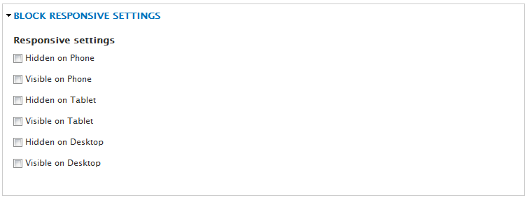
The Drupalexp Block module allows any block in the system to utilise color background and animate the content using CSS3 animations
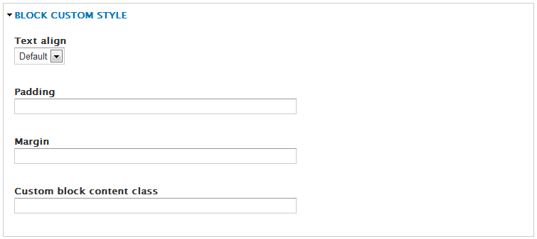
This setting provides the ability to visibility block belong to devices. (different size)
The Drupalexp Blog module of Shoot theme provides 6 viewer styles for blog page.
You can use any media type in blog such as:
Some widgets is used in blog page
Additional, to manage blog categories, go to Structure → Taxonomy → Blog Categories menu to add new item or modify it.
The Drupalexp Portfolio module combine with Drupal BxSlider module to allow dynamic portfolio pages to be created quickly and easily. It provides an excellent starting point for those who want to build a portfolio.
HOT: with Drupalexp Masonry view style only use in this theme, you can build a masonry visually without any complex setting. You can reference here to know to how build a masonry
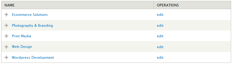
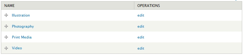
To manage portfolio categories, go to Structure → Taxonomy → Portfolio Categories menu to add new item or modify it.
Drupal Commerce is used to build eCommerce websites and applications of all sizes. At its core it is lean and mean, enforcing strict development standards and leveraging the greatest features of Drupal 7 and major modules like Views and Rules for maximum flexibility.
Core Features
You can reference to Drupal Commerce to learn more about commerce
Now, if you do not intend to use commerce in your website. You can temporary disable modules as below to increase performance
To install Drupal commerce in your website, some modules is required:
And some related modules
To work with Drupal commerce, you should understand clearly concept Product Display and Product variations in Drupal commerce before. So, we strongly recommend you read Product document before continuing.
Shoot is a clothes shop in demo, but you can easily build any shop type which you want.
In Shoot, we have created a "product display" content type to show products with some fields:
Shoot shop comes with some useful widgets block. It is usually use in commerce websites such as: